
 Some months ago, I saw advertised – on Twitter, I think – a one-day course on printing on a wooden press (of the type Gutenberg would have used, it is thought), run by the Dürer Press Group, at the St Bride’s Foundation, off Fleet Street, London. This seemed a terrific way of getting some practical experience of the origins of the industry in which I toiled for all of my working life, so off I went last week.
I was disconcerted to discover that I was the only person on the course: this was followed by extreme gratitude when I realised that therefore I would have the undivided attention of Dr Claire Bolton of the Alembic Press, a member of the Dürer Press Group and the course tutor, whose knowledge, enthusiasm and patience with my clumsiness I cannot praise highly enough.
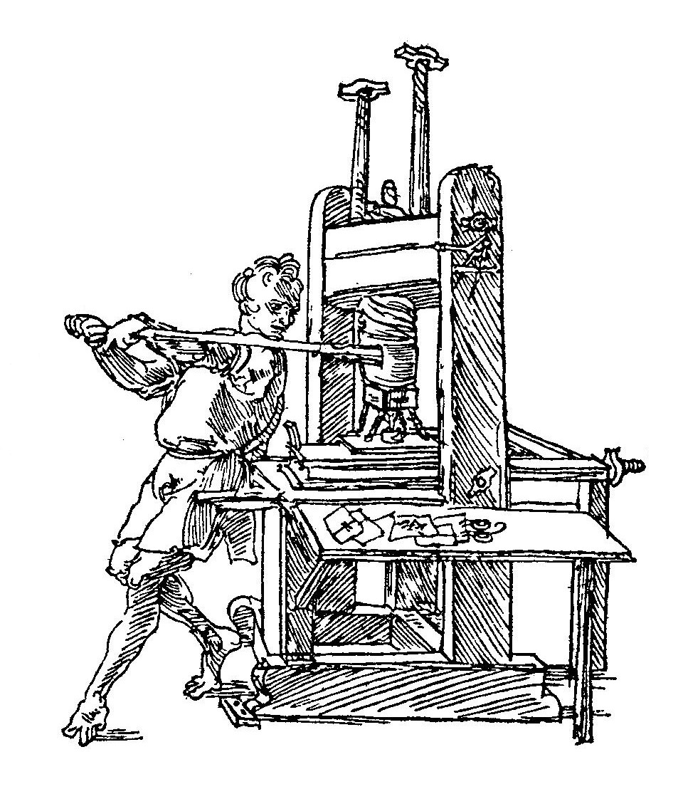
Dürer’s sketch of a press in action.
The focus of the day’s activity was a modern wooden press constructed by Alan May: its nickname is Albrecht, and it/he was commissioned by the Dürer Press Group for experimentation on the techniques and processes of the earliest printers.
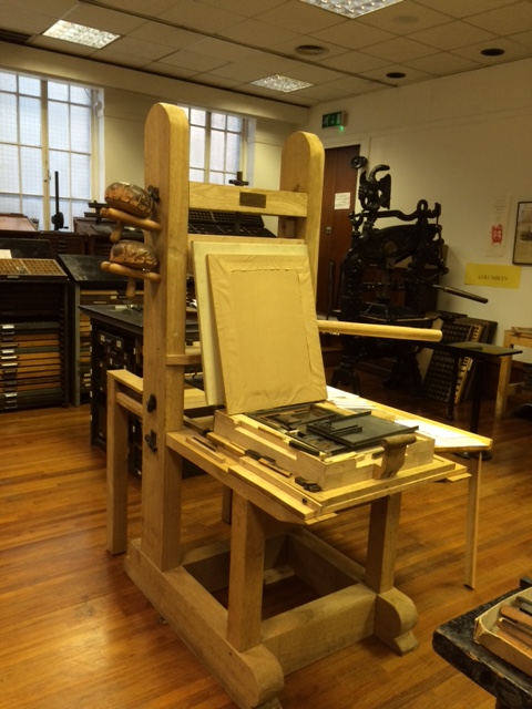
Albrecht, ready for business.
This press, and the one also made by May for the university of Reading are based on research and expert practical understanding of what a fifteenth-century printer must have had to do to make things work: there is surprisingly little documentation from the early days of printing about how it was done.
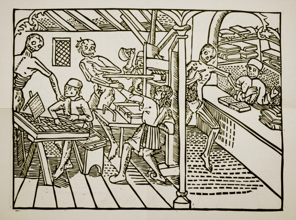
From 1499, one of the earliest depictions of a press, as the dance of death makes its way through a print shop. (The proofreader looks annoyed at being disturbed.)
Apart from illustrations (which may not of course be technically accurate), information comes mostly from accounts: so much paid to the carpenter for replacing a part, so much for more lead, so much for inks, and so on.
We began almost at the beginning, with setting type in a composing stick. (To have really begun at the beginning would of course have involved a punch, a matrix and a lot of boiling lead, about which there seem to be health and safety issues, sadly.)

Plaque on the Manutius family home in Venice. Aldus’s workshop was destroyed in the nineteenth century. The current building on the site is a 1960s bank of such hideousness that I will not show it to you.
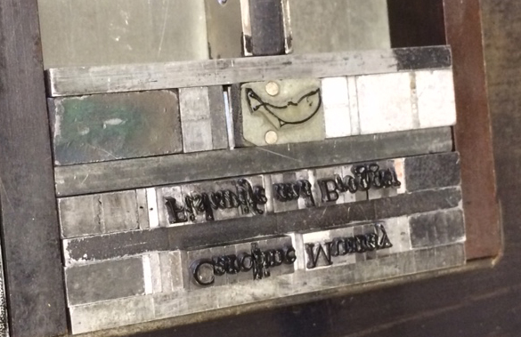
An extremely heavy, shallow, compartmentised wooden tray of type (Bembo 16/18, the name deriving from the sixteenth-century poet and cardinal (and friend of the great printer Aldus Manutius), whose family home in Venice is now a Biennale venue) was produced, along with a little block depicting a fish: I had to decide on a form of words involving a fish for a ‘business card’.
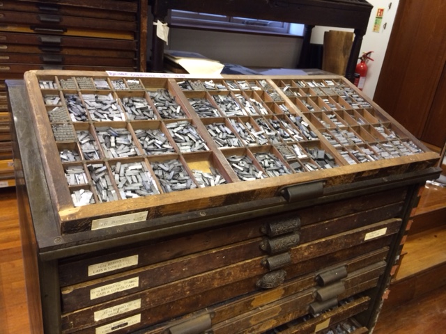
A tray of Bembo roman type: very heavy, do not drop, or you get to put all the sorts back in the right place. (This hideous mess is called ‘printer’s pie’.)
In spite of my knowing the theory of ‘back to front and upside down’, composing the words and spaces of the phrase ‘Caroline Murray/Fishwife and Blogger’ proved remarkably difficult (especially the italic words – see below!). The origin of the expression about minding your ‘p’s and ‘q’s comes from the easy muddling of these two letters, and the same applies to ‘b’ and ‘d’, which are precariously close to each other in the case.
The Bembo cases had the caps on the right-hand side rather than above the ‘lower case’ letters (hence another familiar expression): even with an idiot guide to the location of each letter in the case, it took me the whole day to find even just ‘a’, ‘e’ and ‘i’ without having to look them up. I asked Claire (who of course did her composing (and breaking down, i.e. putting the letters back again after printing was finished) with amazing speed) how long an apprentice in his first year would have taken to memorise the layout, and she pointed out that probably the hapless youth would have spent his first three years or so sweeping the floor and running errands before he reached the giddy height of being allowed to mix the ink, let alone achieved the absolute pinnacle of the craft of composing.
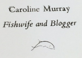
My business card, ready for proofing.
Anyway, here is a sequence of attempts, run on a proofing machine: not a great deal to show for two hours of fairly concentrated effort, but demonstrating gradual improvement.

A disaster at various levels…
Very slightly better…
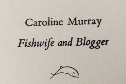
My best shot. (It’s the photo that’s not straight.)
During a brief break for lunch, I went into Wren’s St Bride’s church: the reputation of Fleet Street as a centre for printing (and later for newspaper publishing) began when Wynken de Worde, Caxton’s appropriately named apprentice, moved himself and his press from St Paul’s (the historic centre of scrivening, or manuscript copying, where Caxton had his workshop) to St Bride’s.

St Bride’s Church from Bride Lane.
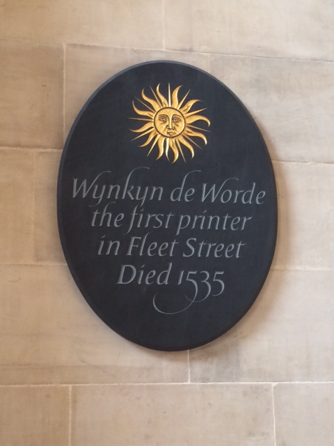
Wynken de Worde’s memorial plaque, in the church where he was buried.
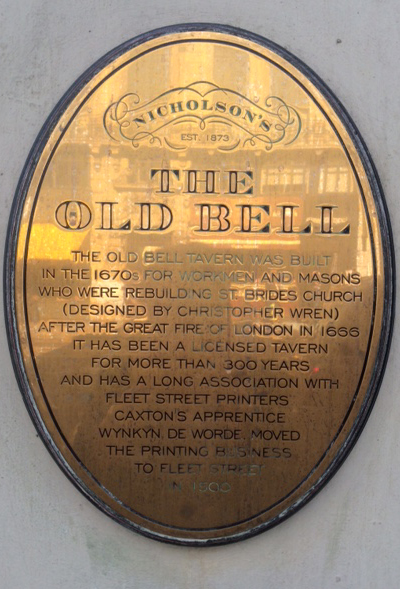
Sign on the Old Bell pub, Fleet Street.
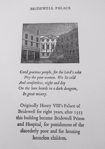
Back in the print room, we decided to use another picture block, believed to show Bridewell Palace, with a very short account of its change from palace to prison and orphanage after 1553 – ‘bridewell’, like ‘bedlam’, having later been used to name any institution for the ‘disorderly poor’ and especially for fallen women.
(The original St Bride’s well was presumably fed from the Fleet river: another block in the collection shows a tree, its roots in a well, dripping down water from which one man drinks and another carries of buckets hanging from a yoke over his shoulders. The well has long vanished: in 1915 there was a pump in a niche in the churchyard, but that seems to have gone too.)
I decided to use a piece of verse from one of the many versions of ‘The Cries of London’, and this was nearly my undoing, because we thought the verse would look nice in italic type. If recognising roman letters back to front and upside down is difficult for the uninitiated, doing it in italic is well-nigh impossible – and in my defence I have to mention that a lot of the individual sorts, when we came to proof the piece, turned out to be ‘wf’, an indication which I had blithely used when marking up proofs in my copy-editing days without giving much thought as to why it was wrong or how to correct it.

The first proof: rather a lot wrong…
In this case (ho ho), it seemed likely that the last students using the type had put some sorts back in the wrong compartments (that’s my excuse, and I’m sticking to it). Putting it right involves carefully loosening the furniture which you had previously fixed into place with a mallet and shooting stick, undoing the quoins a little, using a pair of tweezers to replace all the wfs, tightening up the whole thing again, and re-proofing – at which point some further wfs appeared (not to my eye, but to Claire’s expert vision), and we repeated the exercise. (Yes, you do find interesting new meanings for familiar words in the printing trade, to say nothing of less familiar ones like frisket, tympan and flong.)
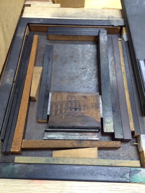
The block in place, surrounded by furniture, but no quoins yet.

Getting ready to move lines of type into the forme.
Using slightly damp paper (achieved by layering every 25 pages or so with damp cloth – which leaves a unique impression on the adjacent paper which sometimes remains visible in early books!), and with Claire’s help in aligning it correctly in the frame, I slid the ‘sandwich’ of wood and paper under the platen, and pushed on the handle to rotate the screw downwards: you walk a semi-circle, and it’s surprisingly heavy work (I cursed my gimpy left elbow). You then walk the same semi-circle backwards, pulling on the handle to raise the platen up again, pull the sandwich out, remove the layers, and examine the result. Too much ink, too little ink, pressure not evenly distributed, paper shifted slightly under the platen? So you make a few adjustments and try again – and again.
The complete sheet.
After several attempts, I managed to get a reasonable (amateur) print, of which I am absurdly proud, and about which I have not stopped boasting to my friends since. It was a brilliant experience, enormously educational and hugely fulfilling. I simply can’t understand why nobody else was on the course, and I urge you all to go!
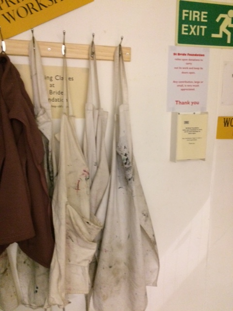
Printers’ aprons hang ready…
Meanwhile, I’m casting covetous eyes at very small proofing presses on the web – as well, of course, as minding my ‘p’s and ‘q’s…
Caroline

If I had known about the course I would have been there! It sounds great.
When I was getting my Ex Libris (a hand-carved wood engraving that is a thing of real beauty itself) printed a few years ago I spent an hour at the printer’s workshop, like a boy in a toy shop – ‘what is this’, ‘what does that do’ etc. etc. He actually had some type that had been ‘rescued’ from CUP when they were chucking it out.
This post did bring to mind the Guardian’s San Seriffe article (not that I saw it when originally published of course – I was precocious but not that precocious): http://image.guardian.co.uk/sys-files/Guardian/documents/2012/03/23/SanSerriffe1.pdf
LikeLike
Thanks, Damian. Did you know that the UL also runs (free) printing courses? I’m hoping to get a place on the Lent Term one… http://www.lib.cam.ac.uk/deptserv/rarebooks/historicalprinting.html
LikeLike
Thanks for that Caroline. I will investigate and possibly be joining you then. As my wine-tasting course will be finished soon I was looking for a new extracurricula activity.
LikeLike
Pingback: Etty Before Aunthood | Professor Hedgehog's Journal
Pingback: Summer of the Slug | Professor Hedgehog's Journal
Pingback: Plantin and Moretus | Professor Hedgehog's Journal
Pingback: First Catch Your Unicorn | Professor Hedgehog's Journal
Pingback: St Antholin’s | Professor Hedgehog's Journal
Pingback: Robert Harrild and Sons | Professor Hedgehog's Journal
Pingback: St Martin within Ludgate | Professor Hedgehog's Journal
Pingback: Printing R-Evolution | Professor Hedgehog's Journal
Pingback: A Bizarre Story | Professor Hedgehog's Journal